> ## Documentation Index
> Fetch the complete documentation index at: https://docs.pushbase.dev/llms.txt
> Use this file to discover all available pages before exploring further.
#
> The Notification Inbox component for your app.
Push notifications are a powerful way to engage your audience.
However, in some cases, delivery may fail due to device settings, network issues, or battery optimization.
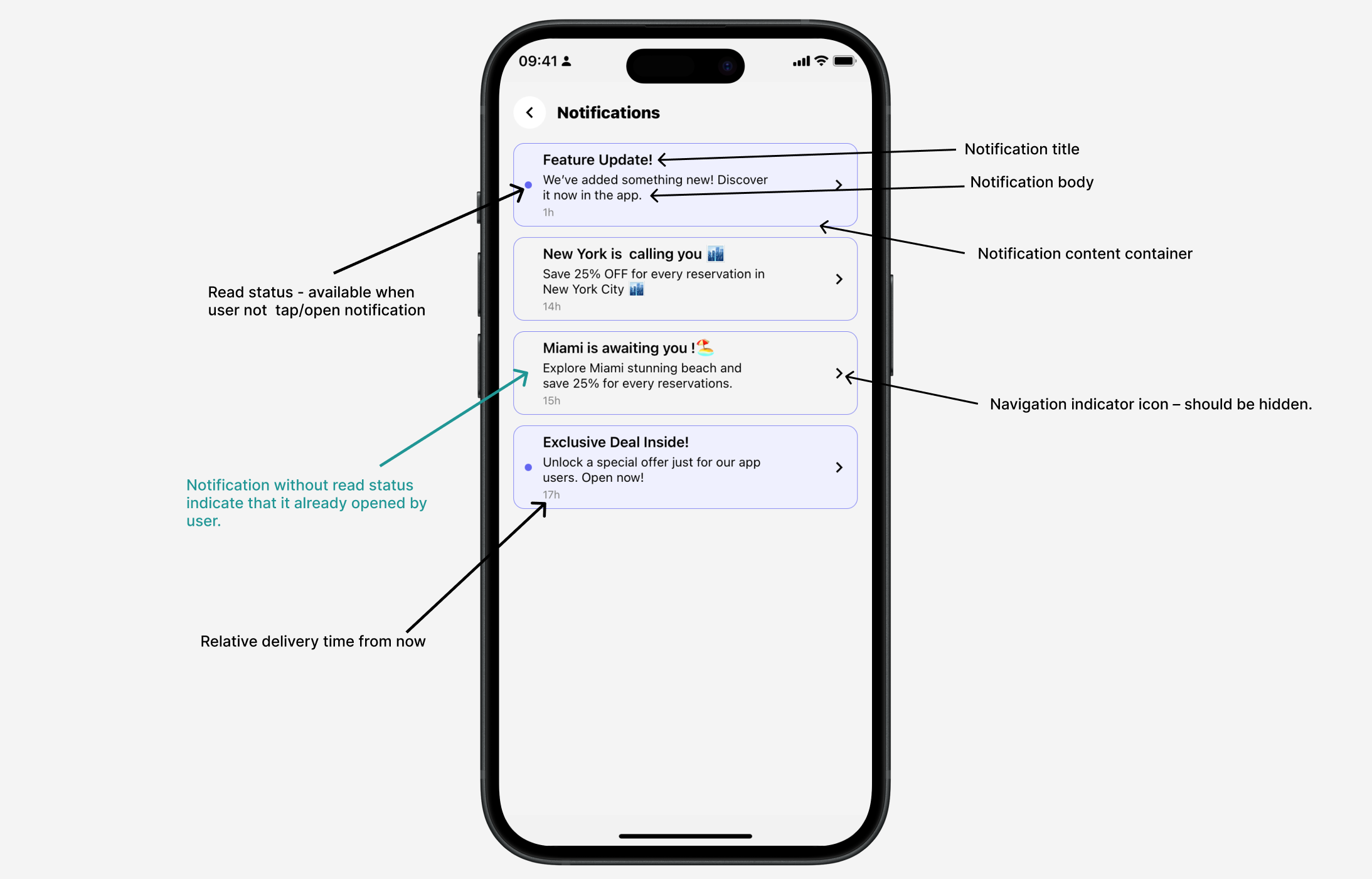
The Pushbase SDK includes an `` component that displays a list of past notifications sent to the user’s device.
This component is fully customizable to match your app’s branding and design, and supports deep linking to direct users to specific screens when a notification item is tapped.
 ```js theme={null}
import { View, Text, ActivityIndicator } from "react-native";
import { Inbox } from "@pushbase/sdk";
export default function NotificationsScreen() {
return (
Recent Notifications
{/* Add Inbox component*/}
} */}
/>
);
}
```
### Customizing `` component
The `` component provides multiple props to help you customize its appearance and behavior to fit your app’s design system.
**Props**
Item container style.
Notification title text.
Notification body text.
Time since notification was delivered text.
A valid color string used for the read status indicator on notification items.
A valid color string used as the background for notification items that are
unread or unopened.
A valid color string used for navigation indicator icon.
A boolean flag to show or hide navigation indicator.
Message shown when the user has no notifications.
Style for empty list message text view
A valid React element to render for custom content loading indicator or
skeleton. Component use React Native built-in ``
component by default.
Specifies the number of days from today to filter and match notifications
delivered within that period. Defaults to 7 days.
Having trouble setting up or configuring the SDK? Our support team is here to
help — [feel free to reach
out](mailto:hello@pushbase.dev?subject=Pushbase%20Product%20Support)
```js theme={null}
import { View, Text, ActivityIndicator } from "react-native";
import { Inbox } from "@pushbase/sdk";
export default function NotificationsScreen() {
return (
Recent Notifications
{/* Add Inbox component*/}
} */}
/>
);
}
```
### Customizing `` component
The `` component provides multiple props to help you customize its appearance and behavior to fit your app’s design system.
**Props**
Item container style.
Notification title text.
Notification body text.
Time since notification was delivered text.
A valid color string used for the read status indicator on notification items.
A valid color string used as the background for notification items that are
unread or unopened.
A valid color string used for navigation indicator icon.
A boolean flag to show or hide navigation indicator.
Message shown when the user has no notifications.
Style for empty list message text view
A valid React element to render for custom content loading indicator or
skeleton. Component use React Native built-in ``
component by default.
Specifies the number of days from today to filter and match notifications
delivered within that period. Defaults to 7 days.
Having trouble setting up or configuring the SDK? Our support team is here to
help — [feel free to reach
out](mailto:hello@pushbase.dev?subject=Pushbase%20Product%20Support)